Creating a Toolbar is not trivial. There are several steps to follow and some need to be performed in the right order. This HowTo's real usefulness is in its listing of the steps:
Press Ctrl-T to open the Tools dialog. Select Microsoft Windows Common Controls.
Add an ImageList control to the form.
Left-click on the ImageList and select the Properties command.
Click on the Images tab.
Click the Insert Picture button and find your button bitmaps. You can probably find the standard Windows 95 bitmaps in the Common/Graphics section of your computer's programming area. On my computer this is:
C:\Program Files\Microsoft Visual Studio\Common\Graphics\Bitmaps\TlBr_W95
When you have added all your button images, click the Ok button.
Add a Toolbar control to your form.
Left-click on the Toolbar and select the Properties command.
On the General tab, find the ImageList field (3rd from the top in my version). Select the ImageList control from step 2.
Click the Buttons tab.
Click Insert Button to add a button to the Toolbar. Fill in appropriate fields:
Caption appears on the button. For a normal button, leave this blank.
Key is passed to the Toolbar's event handler. This is one way you can tell which button was clicked. Enter a short key word here.
ToolTipText is displayed when the user lets the mouse rest over the button. Enter something short but helpful here. Remember that the user sees only a small picture if Caption is blank, so even very short text is useful here. For example, "Cut" is a good tip for the cut button.
Image is the index of the button's picture in the ImageList control. 0 means no image. 1 is the first image in the ImageList.
Experiment with the other button properties to see how they work.
When you have added all the buttons, click Ok.
Double click on the Toolbar to open the code editor in its ButtonClick event handler. This routine takes as a parameter a Button object representing the button pressed. Look at Button.Key to see which button was pressed.
Note that if you modify the ImageList after you have attached it to the Toolbar, you may mess up the Toolbar. For this reason, you should try to put every picture you will need in the ImageList first. Then initialize the Toolbar.
When the user clicks a button, the Toolbar control's ButtonClick event fires. You can use the buton's Key property to tell which button was clicked.
Private Sub Toolbar1_ButtonClick(ByVal Button As _
MSComctlLib.Button)
Select Case Button.Key
Case "Cut"
MsgBox "Cut"
Case "Copy"
MsgBox "Copy"
Case "Center"
MsgBox "Center"
Case "Snapshot"
MsgBox "Snapshot"
End Select
End Sub
Some additional tips from Gary German:
Toolbar graphics can be assigned from external files at runtime. But, the graphics on each toolbar must all be the same size, otherwise they'll look bad. Specifically, the first button to which a graphic is assigned "wins", and all following graphics will be stretched, if necessary, to fit in that same size.
Max number of buttons on a toolbar is 255.
If you need to create some buttons with graphics, and others with text only, don't use the button's .Caption property - it will cause all buttons to grow vertically because the text is placed below the missing graphic. Instead, use a routine to turn the text you want to display into a graphic, and assign this "graphic" to the image list, and then the toolbar button.
ASP.NET is a development framework for building web pages and web sites with HTML, CSS, JavaScript and server scripting. ASP.NET supports three different development models: Web Pages, MVC (Model View Controller), and Web Forms.
Thursday, July 23, 2009
Subscribe to:
Comments (Atom)
Using Authorization with Swagger in ASP.NET Core
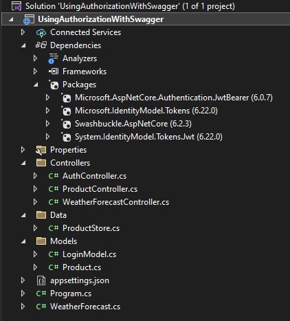
Create Solution like below LoginModel.cs using System.ComponentModel.DataAnnotations; namespace UsingAuthorizationWithSwagger.Models { ...

-
Codebehind C#: public static Bitmap CreateFirstCard(string Name,string MembNo,string Mobile,string Phone, ...
-
VideoGallery.aspx <div class="matter-area fl"> <h2>Videos</h2> <p> <asp:Repeater ID=...
-
Inbox.aspx <%@ Page Title="" Language="C#" MasterPageFile="~/Marketing/admin.master" EnableEventValid...

